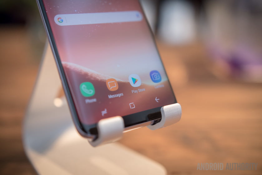
Although we’re all using Android, there’s a large variety of OEM software and skins running on top, presenting us with plenty of welcome choice, for the most part. However, manufacturers don’t seem to be able to settle on a design for very long, with both the new LG G6 and Galaxy S8 reinventing the wheel once again. Even Google looks to have yet another Settings menu redesign in mind for Android O. If you’ve become accustomed to the familiarity of an old design, there’s nothing more jarring than having to adapt to a whole new look and feel when upgrading to a new smartphone from the same manufacturer.
LG
Both Samsung’s Touchwiz / Samsung Experience and LG’s UX have been through a number of UI iterations over the past few years, with notable changes occurring with pretty much every new model. Following the G4’s introduction of dual window and its LG SmartWorld app, the G5 switched up the colors of its notification and settings toggles, revamped the settings menu, and even tweaked the buttons on its recent apps overview. The G6 makes yet more changes, with a revamp of its icons and launcher, introducing Google Assistant as a long press function on the home button, and making a swathe of tweaks to its camera app and others.
Samsung
Samsung has been through a similar number of changes recently. The Galaxy S7 saw the introduction of a new white quick settings and notification menu, new animations, and an overhaul of its settings menu that tucked a lot of options under a new ‘Advanced Features’ tab. The company’s UI also received the ability to drag multiple apps on the home screen, always-on display technology, and the company’s Game Launcher and tools. Not to mention the additional features introduced in the edge variants of its flagships. Then the Galaxy Note 7 came along and revamped everything before being recalled.
The Galaxy S8 now has an entirely new software home button layout, icons and the settings have changed once again, and the launcher now also features a Bixby hub page over to the left. So why do OEMs seem intent on constantly switching things up every year when there are much more important things to focus on like battery life?
Are we there yet?
The most obvious reason would that be that companies are yet to perfect a UI design, and are constantly improving their software to offer consumers a better experience while also staying ahead of the competition. LG has long come under fire for its UI, mostly for being sluggish, bloated with too many semi-useful features, and even removing the app drawer in early G5 software.
For LG, the G6 is an attempt to claw back market share after its failed experiment with the modular G5. It’s therefore likely that the company has refreshed its UI to make sure that it offers consumers a software experience that stands up well against the market leaders, who have also refreshed their interfaces.
This begs the question ‘why not just go stock?’ The default Android UI is beloved by many smartphone enthusiasts.
Of course this begs the question ‘why not just go stock?’ The default Android UI is beloved by many smartphone enthusiasts, offers up a solid balance of features and snappy performance, yet it hasn’t changed drastically for many years. The obvious conclusion is that LG, and other companies for that matter, believe that they can do a better job than Google.
There’s always an incentive to add in additional features and make the most of a phone’s unique technology, such as LG’s 18:9 display, by embedding more options into the core OS and UI. Of course, this risks bogging down the UI with too many options that customers may not ever even use. However, the G6 seems highly optimized for performance and battery life, so these changes aren’t always a bad thing.
Breaking bad
For Samsung, the reasons for its recent changes may be a little more self motivated. The launch of its latest flagship is still firmly sat in the shadow of the Note 7 fiasco, and Samsung is surely keen to convince customers that the Galaxy S8 is not at all associated with the problems of the past. A new physical look and a major overhaul of its UI are pointers that the S8 is an entirely new handset.
Furthermore, the switch over to software keys from the old physical layout, means that the Galaxy S8 is losing one of its key brand identifiers. A new look UI is likely there to act as a new differentiator, just look at the unique software home and back button icons.
Samsung has long been the most reluctant OEM at adopting Google’s take on the way Android should look, instead preferring to carve out a more unique look with its user interface and duplicating every Google app imaginable. For Samsung, its UI is as much about creating a look that is instantly recognisable as a Samsung device as it is about offering users functionality.
It’s difficult to blame OEMs for continuously tweaking with its core software, as the competitive nature of the market is still pushing manufacturers to offer new and unique features that go beyond its competitors. However, the sheer volume of tweaks, some subtle and some obvious, can be frustrating for consumers who want core features to feel familiar when they switch to a new model. Upgrading to a newer phone in the same product line shouldn’t be as jarring as switching companies altogether. Change can be good, but not when it’s change for change’s sake.
Are you fed up with OEMs constantly changing their user interface every year, or are you happy for companies to continue to experiment in the pursuit of creating better software? Perhaps you even just like change so that your phone feels like a bigger shift from older models? Sound off in the comments below.
[Source:- Androidauthority]


