/cdn.vox-cdn.com/uploads/chorus_image/image/55793993/jbareham_170321_1552_0034_v02.0.jpg)
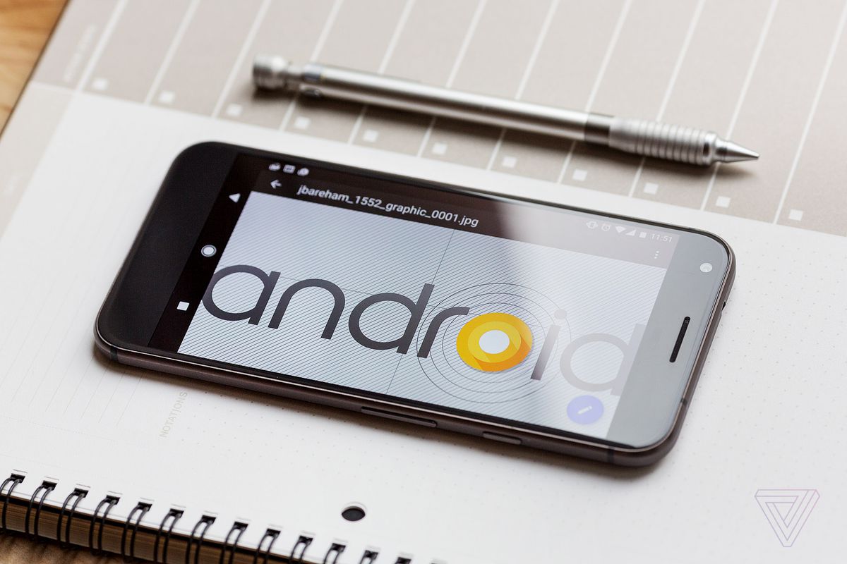
Almost two dozen employees from Google’s Android team held a Reddit AMA today and invited questions about the next major Android update, version 8.0. Android O is slated to be released — at least on Google’s own hardware — within the next couple months and focuses primarily on your phone’s “vitals” like battery life and notifications. User-facing features will include picture-in-picture support on phones, notification badges, adaptive icons, and more. Today’s Q&A session was heavy on engineering and API discussion; it was really intended to revolve around the inner workings of Android, but the team revealed some tidbits that everyday users might also find interesting.
No, we still don’t have a name.
Is it Oreo? Oatmeal cookie? Who knows. Android’s engineering team said that O’s final branding will be announced “later this summer.” More specifically, it’s expected that Android 8.0 will be released sometime in August. “There are so many snacks to choose from,” the team wrote.
Bluetooth audio on the Pixel should get much better in Android O.
Many owners of the Pixel and Pixel XL — myself included — have complained about the Bluetooth audio performance on Google’s smartphones. There are frequently dropouts when listening through some wireless headphones or through a car’s audio system. Google’s engineers seem to be aware that things aren’t great, as they promise a noticeable improvement in Android O. “Our testing shows that BT audio reliability is drastically better vs N,” wrote Tim Murray. ”We hope you see the same kind of improvements.” Me too, Google. Me too.
But even the Pixel won’t get every new Android O feature.
Android O lets device makers, if they so choose, give customers greater control over the color balance of their smartphone’s display. Unfortunately, last year’s Pixel and Pixel XL won’t be capable of this granular fine-tuning that could help perfect a screen’s white balance. “Color management will not be available on Pixel 2016,” explained Romain Guy. “It’s a device-specific feature that requires calibration of the display on the factory floor, it’s thus optional and cannot really be retro-fitted on older devices.” Oh well.
Here’s Google’s more technical explanation for why the Blobmoji are going away:
“Over the last few years Unicode has expanded the range of emoji considerably and created new categories of emoji. In parallel new messaging use cases have emerged (ie: larger emoji used as stickers). The current design system did not lend itself well to supporting the expanding emoji set and these new use cases, so we needed a significant visual refresh.”
Yes, the notification shade is really supposed to be white.
/cdn.vox-cdn.com/uploads/chorus_asset/file/8880385/notification.jpg)
One of the biggest early surprises of the Android O beta was a much lighter notification shade. Instead of sticking with the dark gray slide-down quick settings area that it’s used in recent years, Google basically inverted things and turned the background white and icons black. Some wondered whether it was a glitch or just a temporary change during the beta, but it sounds like the Android engineers have settled on it.
“The overall goal was to align the lighter notification surface with quick settings. As a consequence we did switch the default theme of quick settings and made it more consistent.” So the logic is that since notifications have a light background, the quick settings section should be similar. This really only affects devices that run stock or near-stock Android. As always, other Android OEMs (Samsung, LG, etc.) are free to skin away and use their own preferred themes.
Letting you apply custom color themes to Android isn’t as easy as it sounds.
Perhaps you think you’ve got better taste than Google’s designers and engineers and would love to apply your own color scheme to your phone’s menus. It sounds simple enough in concept, but Alan Viverette points out some of the challenges that’ve stopped Google from giving users quite that level of customization power:
TL;DR Theming is not hard. Reliable and consistent theming is hard.
There are technical and logistical issues with theming. The technical side is largely solved in O with RRO support (thanks Sony!); however, we still don’t have stable APIs for describing what can be themed or adequate ways to verify that existing applications properly support theming.
You might remember a dark theme making brief appearances in previous releases — since we already had a dark Material theme, we didn’t have to worry about APIs to describe the themeable properties; however, we were unable to convert every existing app (ex. Calendar, Photos, other bundled and core apps — even Settings was a challenge) to support dark Material theme and verify that it was properly supported.
If you had, say, a bright pink Hello Kitty theme that’s not a simple brightness inversion, you run into even more complicated cases of ensuring minimum contrast levels for accessibility, picking reasonable secondary and tertiary colors, etc.
/cdn.vox-cdn.com/uploads/chorus_asset/file/8880615/badges.png)
Same goes for changing the color of the navigation bar.
Why can’t you at least change something basic like the color of Android’s navigation bar (where the back, home, and recents buttons are) to your liking? It’s possible on the Galaxy S8, but not on the Pixel or other stock Android phones. “We are trying to find a balance between visual appeal and burn-in protection,” wrote Google’s Selim Cinek. “We initially considered colorizing the navigation bar using the same color as the status bar, but it did draw too much attention to it, distracting from the content.”
“Using a grey would be the safest way to improve this, but that user experience is rather questionable.” (Samsung lets you change the navbar to gray, so maybe that’s a subtle design burn?) “We’re continuously evaluating how we can improve the situation however and thank you for the idea,” added Cinek.
The Android team is still trying to figure out how to do tablet software right.
As the iPad nears a major software revamp with iOS 11, the Android team is staying mum on its own future plans for tablet devices. Traditionally, Android slates haven’t compared very favorably to Apple’s tablet — especially when it comes to the sheer number of native tablet apps available for each platform. Google’s Mike Cleron seems less focused on that and more on figuring out how the form factor should evolve next, writing the following on Reddit:
Honestly, I don’t think tablets is a space where we can meaningfully talk about “completion.” It’s more about figuring out what the next driver of innovation will be for this form factor. We are continuing to invest in productivity use cases (keyboard-driven UI, multiwindow, etc) but also — along with lots of other folks in the industry — working on what the next evolution of tablets should be. For Android, there are some interesting overlaps with tablets given the increasing success of Chromebooks and the recent addition of the ability to run Android apps on Chrome OS. We are working to make the Android developer stories for both form factors (tablets, Chromebooks) identical.
But they’re paying attention to the new iPad Pro’s ProMotion.
The buttery smooth scrolling offered by Apple’s latest tablet and its adaptive refresh rate have caught the attention of consumers — and engineers on the Android team. Some companies have already attempted similar ideas with their own Android hardware, noted Google’s Romain Guy, but Google is clearly aware of the benefits, too:
Sharp has been shipping Android phones with adaptive refresh rates since 2016 (at least in Japan). I’ve been disappointed with my 60 Hz phones since I’ve played with one of those Sharp phones 🙂 Adaptive refresh rates and 120 Hz rendering is something we’ve been thinking about for years (it’s great for 24fps video playback!).
Android O won’t be a major update for smartwatches.
Don’t expect Android 8.0 to radically change much about your Android Wear smartwatch. “Android O will mostly be a technical upgrade for Android Wear,” wrote Hoi Lam. “For example, Wear will get background limits which will help preserve battery with O and users can expect more controls over notifications via notification channels. In addition, we have added new tools for developers to help implement complications and build watch friendly UIs.”
The Android AMA team noted that Android Wear 2.0 brought with it some technical changes that allow Google to update some aspects of the software without requiring a full-fledged OS update, so the company can change things in a more nimble way.
Project Treble was the hardest part of Android O’s development.
With version 8.0 of the operating system, Google is making a foundational change to Android that it calls Project Treble. Treble is (in theory) supposed to help speed up software updates and make them less costly and intensive for device manufacturers. But building Project Treble was perhaps the biggest challenge that the Android team faced when creating O. “Creating that interface was very deep surgery on Android,” wrote Stephanie Saad Cuthbertson. “Invasive, complex engineering that took an enormous amount of effort to get right – media, graphics, location, so much.
[Source:-techcrunch]


